Intro
The Digital Storefront was built in real-timeas an in-center experiment to inform wayfinding through digital, touch-first product discovery and wayfinding experience for high-traffic physical spaces. The goal was simple: reduce friction between inspiration and purchase by combining shoppable editorial, “what’s nearby” cues, and clear indoor navigation in a walk-up context. Working in and nearby shopping centers allowed the team to observe and test with users and intercept shoppers to ask questions about their impressions of the system. The results informed the wayfinding system also outlined in this portfolio.l

Outcomes at a glance
Delivered a high-throughput discovery flow that moved shoppers from browse to locate in seconds
Established a scalable content and QA system that kept imagery and product storytelling consistently premium across partners
Instrumented core interactions to support iteration based on real walk-up behavior
Shipped a hardened, reliable large-format touch experience designed for public environments and continuous use
How the work happened
Product framing
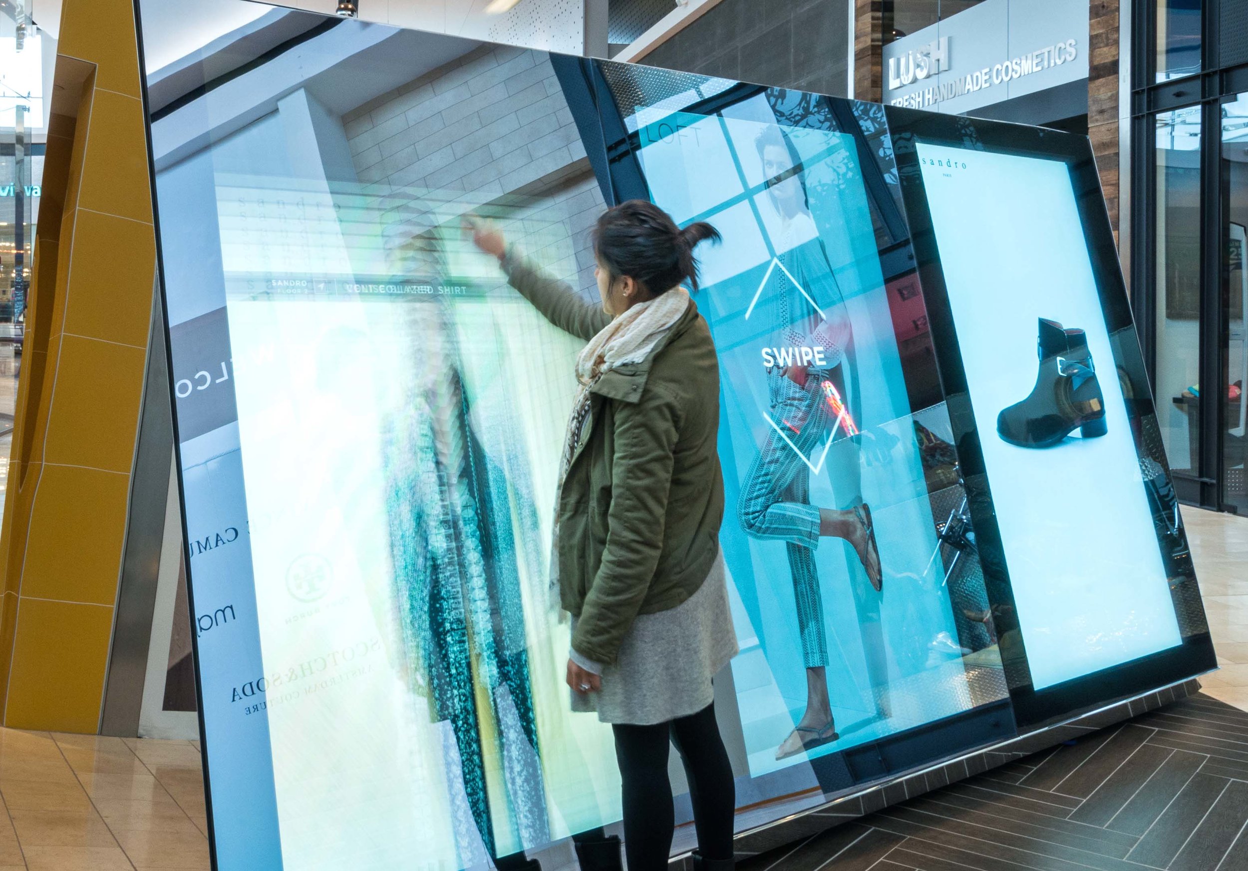
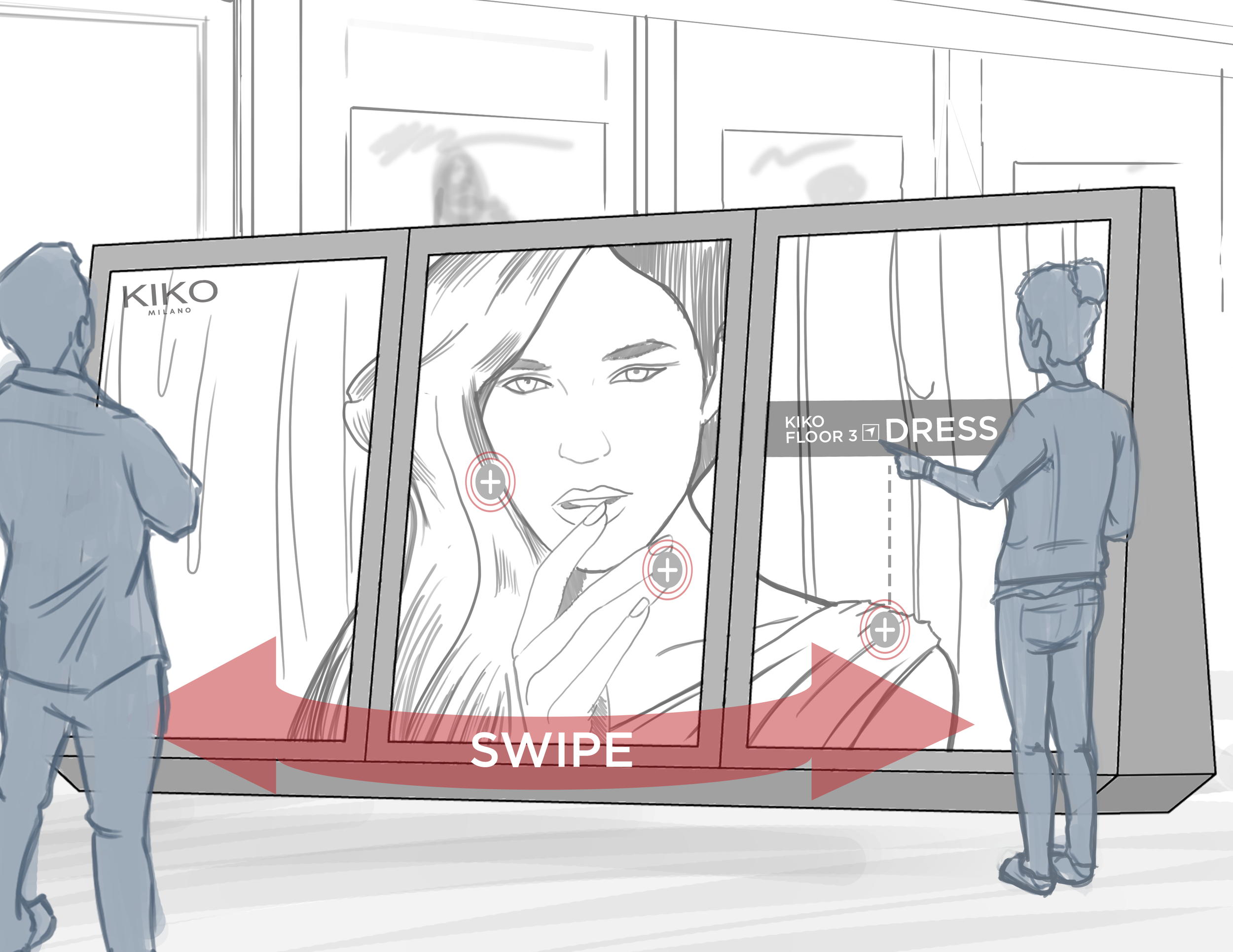
We positioned the experience as a “digital storefront” for physical retail. A product discovery layer for the mall that connected editorial storytelling to precise wayfinding.
Interaction model
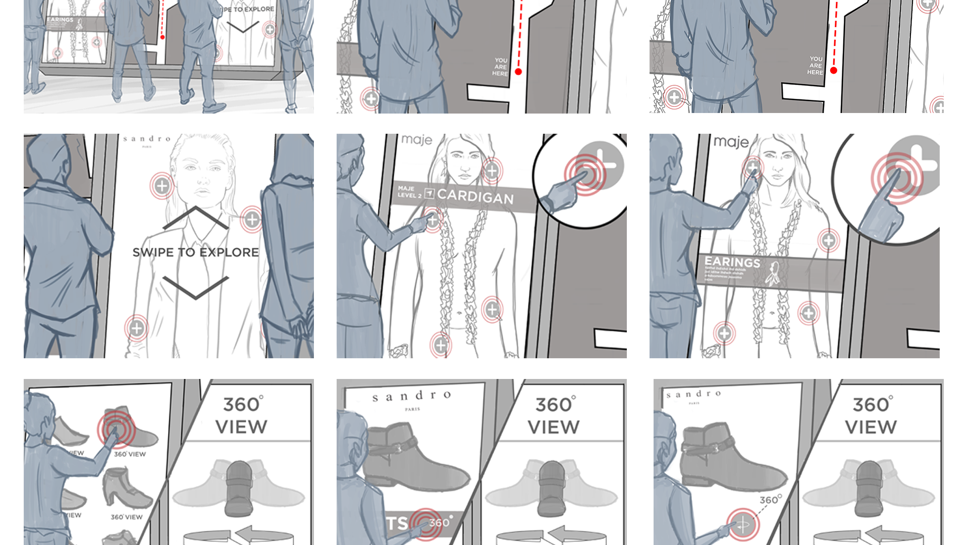
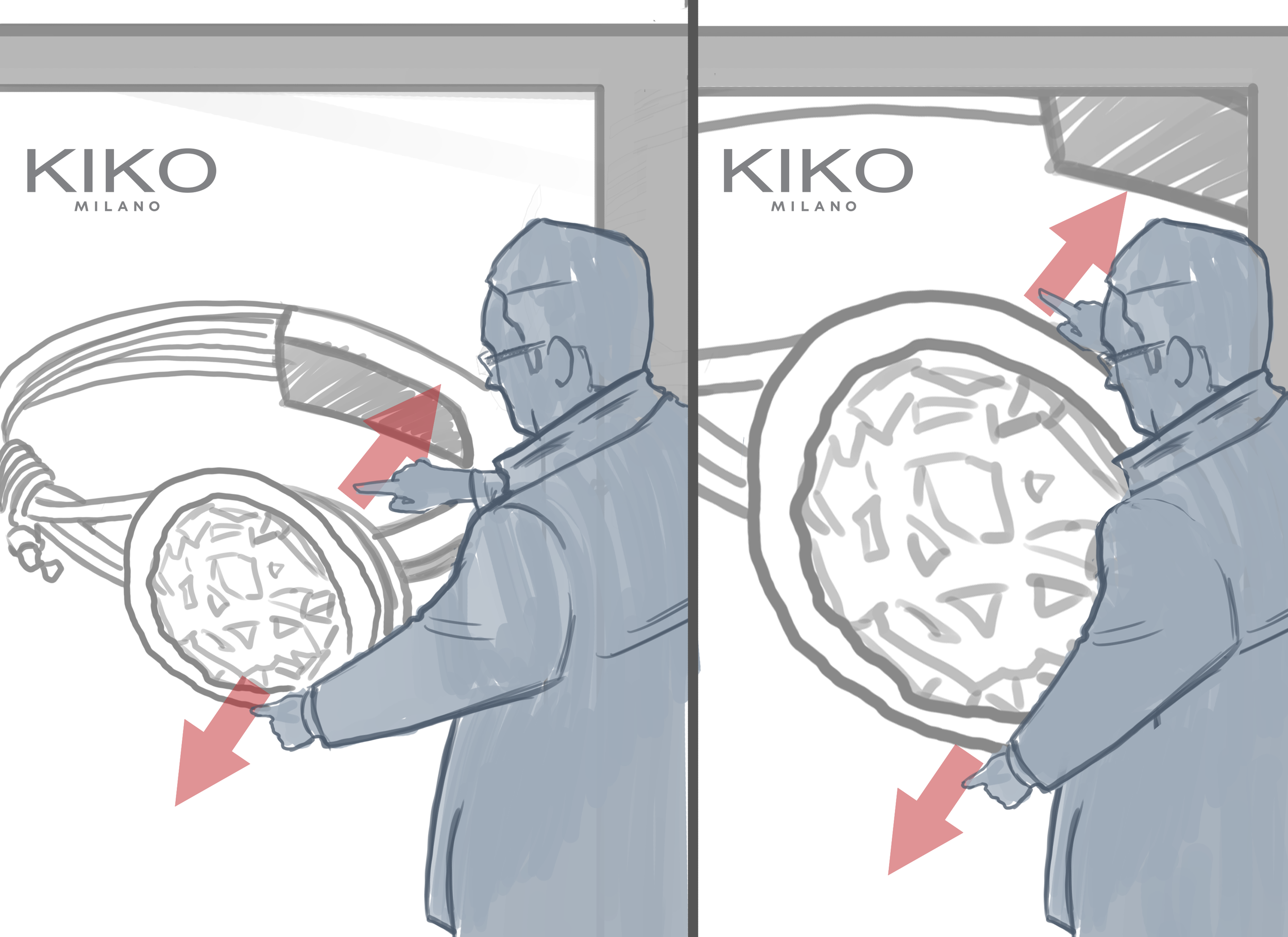
We defined the core set of walk-up behaviors and flows, including browse, zoom, rotate, and “take me there” navigation, designed for speed, clarity, and one-handed use.
Content system and operations
We created partner onboarding standards and playbooks, including photography specs, resolution requirements, cropping rules, and QA workflows to support repeatable publishing.
Performance and reliability
We partnered closely with engineering and vendors to keep the experience fast, legible, and stable on 7-foot 4K displays in uncontrolled, high-use environments.
Constraints we designed for
Walk-up attention windows and “glanceable” decision making
Glare, fingerprints, and continuous public use
Reach ranges, readability, and accessibility considerations
Network variability and operational uptime expectations
Content consistency across many retail partners
What we learned
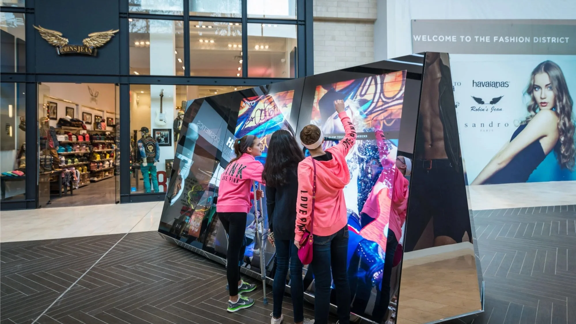
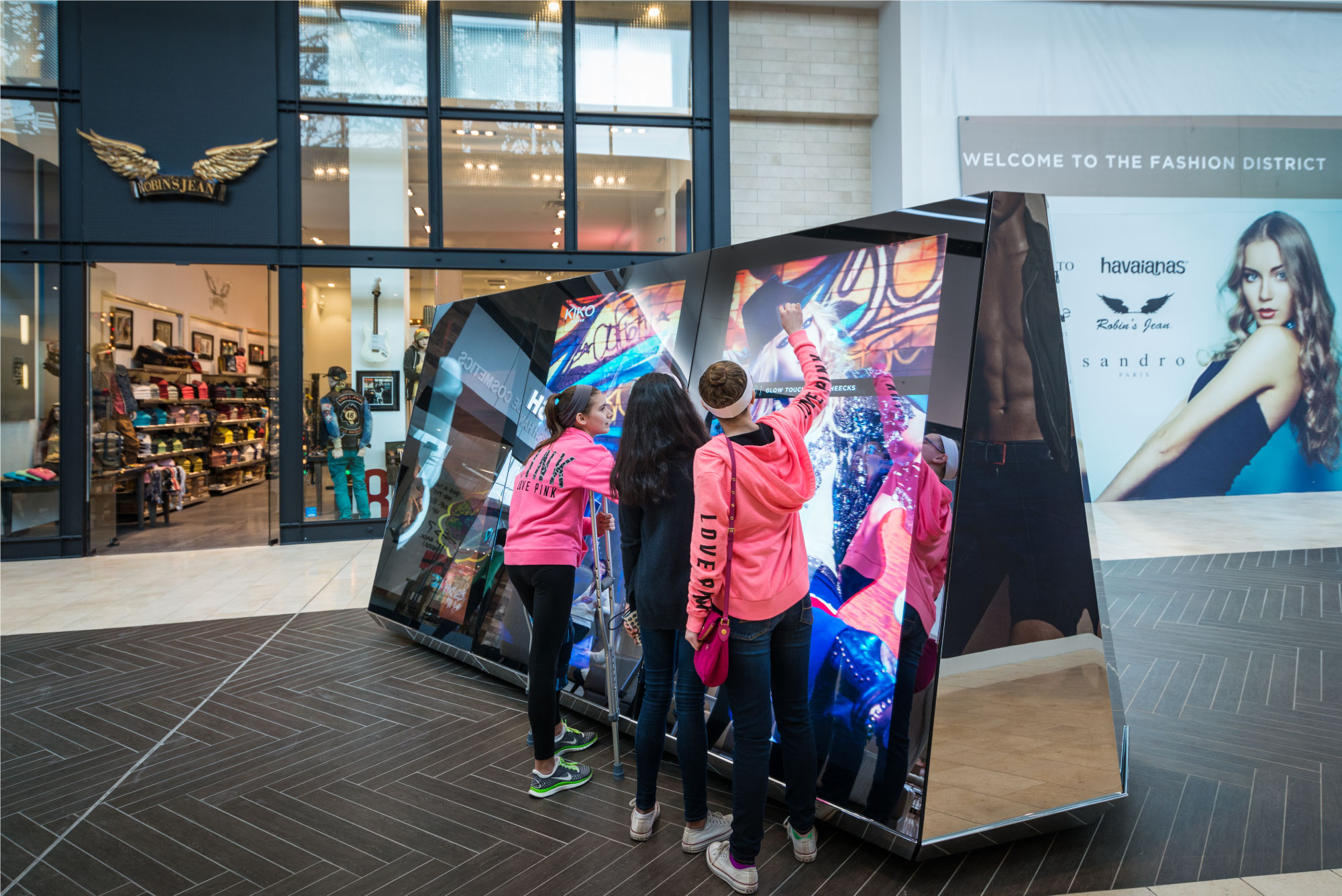
Through qualitative intercept interviews and on-site observation, we learned that many adults felt self-conscious approaching a seven-foot screen in public. The friction was not confusion. It was exposure. People worried about looking awkward, blocking foot traffic, or “doing it wrong” in front of others. Younger shoppers, on the other hand, were more willing to experiment. They treated the screen like a familiar object and moved through flows with less hesitation.
That insight reshaped the experience. We stopped designing for “deep interaction” and started designing for social comfort. We made the first moment more obvious, more permission-giving, and more forgiving. We tightened the interaction model around quick, confident actions that could be completed in seconds, and we emphasized clarity and legibility over novelty. The result was an interface that felt less like a performance and more like a natural extension of browsing.