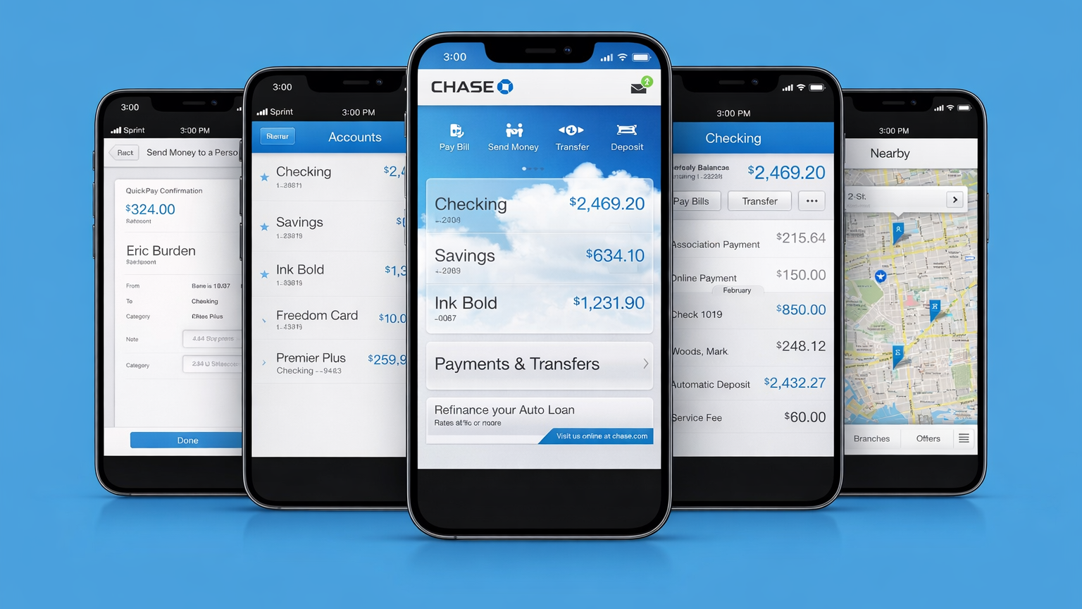
Chase’s mobile redesign was less “fresh coat of paint” and more full-stack product reset. We were rebuilding the experience under intense scrutiny, in the shadow of the financial crisis, while fast-moving challengers like Mint were redefining what “customer-first” could look like in money management. The mandate was clear. Earn trust back, one interaction at a time.
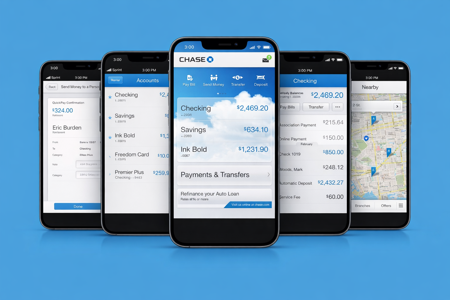
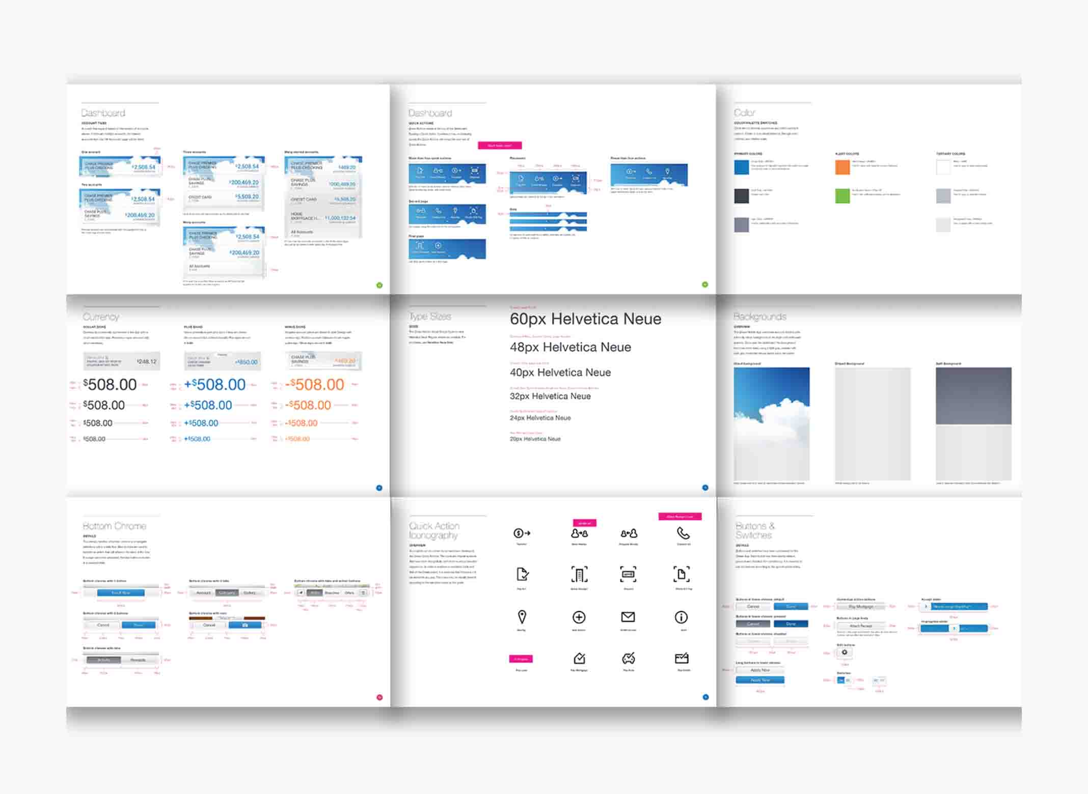
We approached it like a product, not a campaign. With Chase stakeholders, we ran working sessions to align on a small set of non-negotiable goals and the constraints we had to operate within. In parallel, we grounded decisions in user research to understand the real human needs behind the numbers: control, clarity, reassurance, and momentum. That research shaped how we simplified complexity, reduced anxiety in key moments, and designed flows that felt predictable, transparent, and fast.
As Associate Creative Director, I led a team of interaction and visual designers from discovery through execution, owning key journeys end to end. I also produced the core visual design for the flagship screens used to communicate the strategy, align leadership, and set the bar for the rest of the system.