A brand and design system for a more equitable retirement
The Challenge
For most of its first 100 years, TIAA was the retirement provider for educators. But American retirement is now in crisis, with roughly 40% of workers unable to afford retirement. Meeting that moment required more than a refresh. It called for a modern re-founding of TIAA’s brand and how it shows up across channels.
At TIAA, teams were shipping across dozens of products without a consistent UI language. Inconsistent patterns and accessibility gaps slowed delivery and fragmented the customer experience. We needed a design system that could unify the ecosystem and help teams ship faster with a higher quality bar and inviting visuals, but more than that we needed a single source of truth, education and storytelling around how to use a design system, and principles and documentation to guide design and development. That’s what we delivered.
This video highlights our rebrand palettes in action. A key challenge was translating those colors into a token system that supported four distinct, scalable tokenized pallettes.
My role
As Head of UX Creative Direction (Managing Director), at TIAA, I led the team that connected product design and UX with brand and marketing during a major rebrand. Partnering closely with agency teams, I managed managers and a 30+ person org of UX and visual designers, content strategists, and writers to deliver a company-defining outcome: a unified design system and enterprise brand foundation built to scale across products. I owned enterprise-wide design strategy and creative direction, drove stakeholder alignment across UX, Brand, and Marketing, and led the rollout. I stayed close to the work by reviewing product experiences across teams, shaping core principles, and setting the visual bar for UI patterns, typography, iconography, illustration. The result was a design and content system teams could adopt consistently without losing brand integrity. Design became the unifying force to expand access to financial freedom and support a more equitable and accessible retirement experience.

Creative direction and enterprise alignment
I oversaw design direction across the org including UX direction of key journeys in B2C, B2B, and Advice, ensuring brand translation, narrative, visual consistency, and system decisions were grounded in business realities, customer needs, and accessibility. The Design System team became the connective tissue across verticals, channels, and priorities.
1. Enterprise content and design system, from voice to visual language
We built an enterprise-scale system spanning component library, tone of voice and messaging, custom font, color themes, illustration, and icon libraries. I established the structure for design system documentation and pioneered TIAA's first central Content Design System. The goal was consistency without rigidity, so teams could move faster while staying on-brand. The results were tangible: per-screen design time dropped from 4 hours to 1.5 hours, content development time decreased by 40%, and the public homepage at TIAA.org saw 30% faster build times, 38% fewer UI defects after pattern audits, and an 80% increase in enrollment starts after implementing the design system components.
2. Principles, governance, and storytelling that could move people
I established new design principles and behaviors through peer-facilitated discussions that created a common design language across the org. In collaboration with the creative team and DesignOps, I built a federated governance model to clarify design system usage and educate the broader design organization. I also launched emotional design principles and stories to make TIAA's brand more human, more relevant, and more actionable for a new generation of designers and savers. To support adoption, I ran weekly office hours connecting our team to product verticals across B2C, B2B, and Advice, where designers could bring questions about visual and UX principles, patterns, and system usage best practices.
3. Communications design and process
I personally designed and socialized templates for corporate and customer communications, compressing email design time from weeks to hours. This included clarifying the approvals process and partnering with my content strategy team to strengthen language fundamentals across all touchpoints.
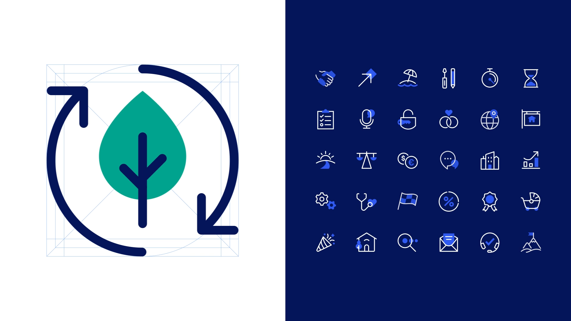
Iconography for the design system prioritized legibility and optimism, balancing utility with delight.
Outcome
A cohesive enterprise brand and design system that improved speed, consistency, and quality across customer experiences. It also gave teams a shared language, shared standards, and a shared purpose, making it easier to ship work that supports more equitable retirement outcomes.
Faster design-to-development workflows
More consistent experience across products and pages increased ease of use
Improved accessibility and compliance readiness
Stronger engagement and clearer user paths on key journeys
Reduced friction and drop-off across priority experiences
Enrollment starts increased, while bounce rates dropped significantly
Why it matters
Retirement is not a nice-to-have. It is stability, dignity, and options later in life. When nearly half of workers cannot afford to retire, the work is not just brand polish. It is a business transformation with real human impact. This program used design to unify teams and scale the promise of financial freedom to more people.
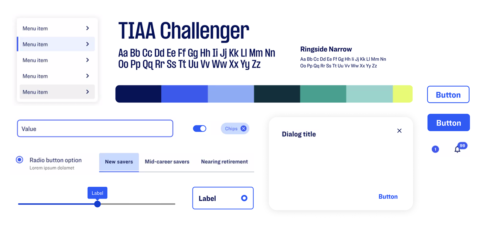
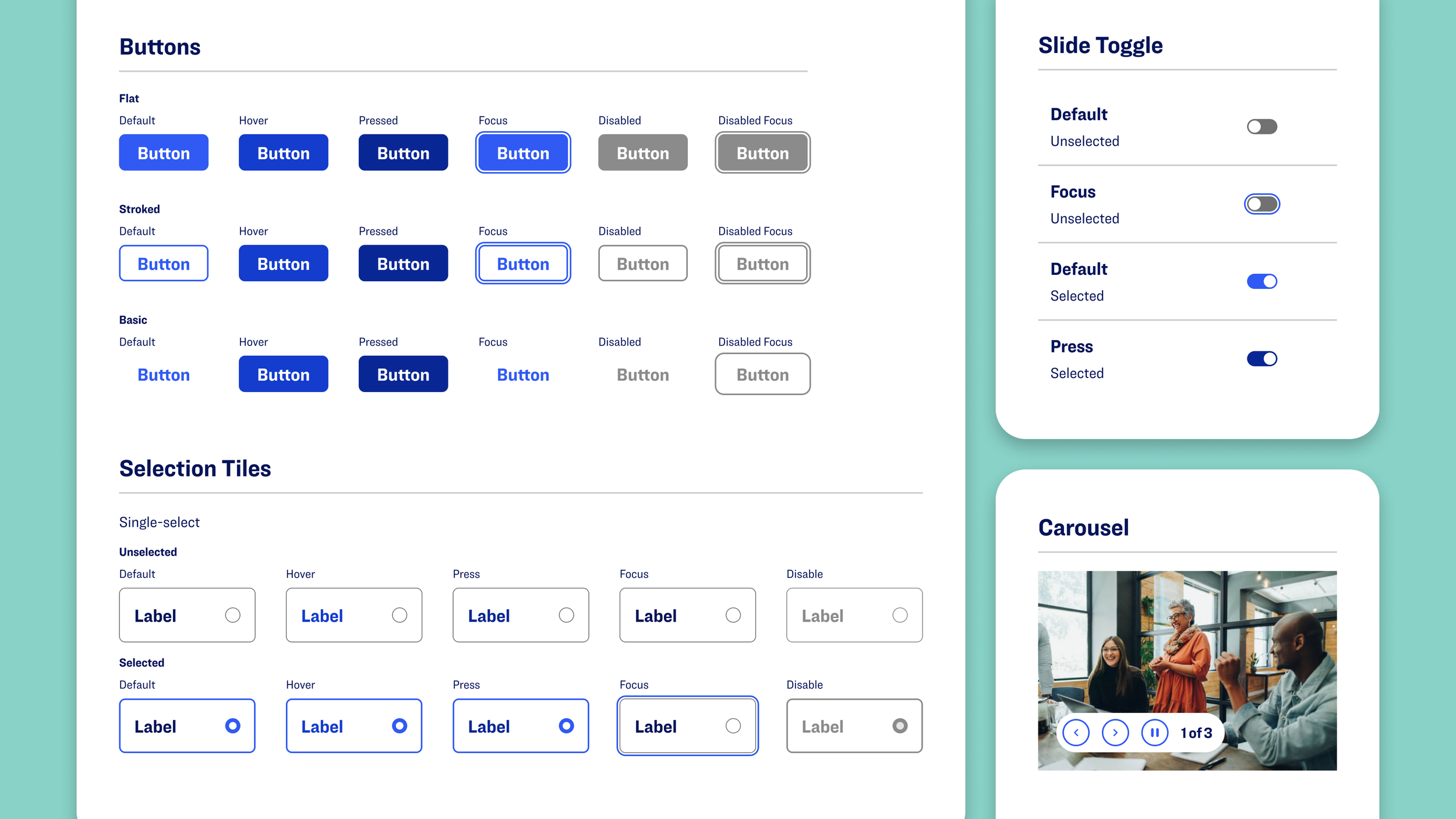
Fifty core components made up the design system, utilizing our newly minted font and token architecture.
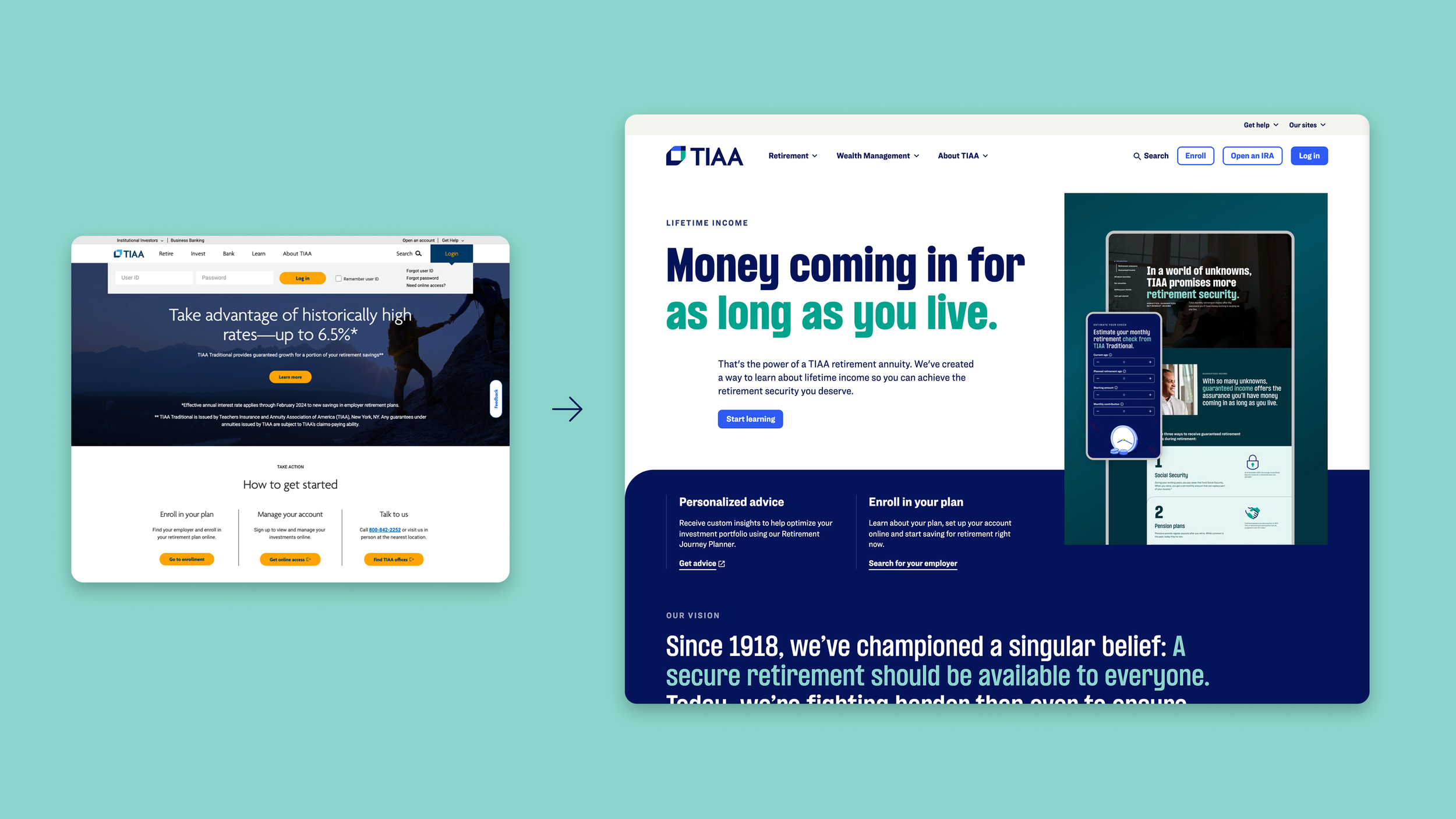
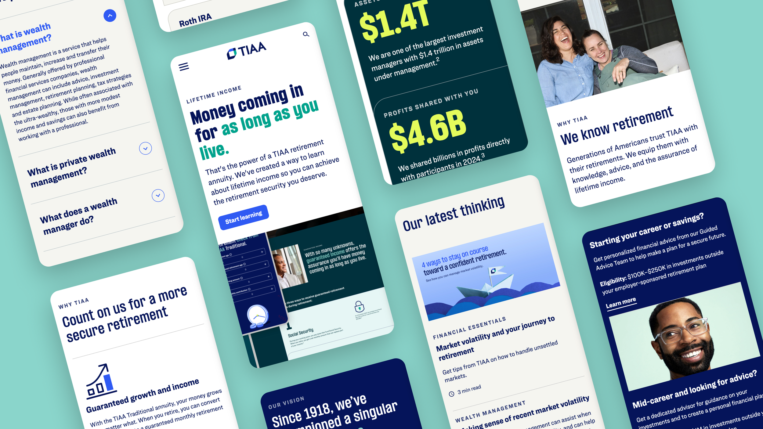
The image on the left is the homepage before the design system, and the image on the right is the new homepage with Ethos implemented.
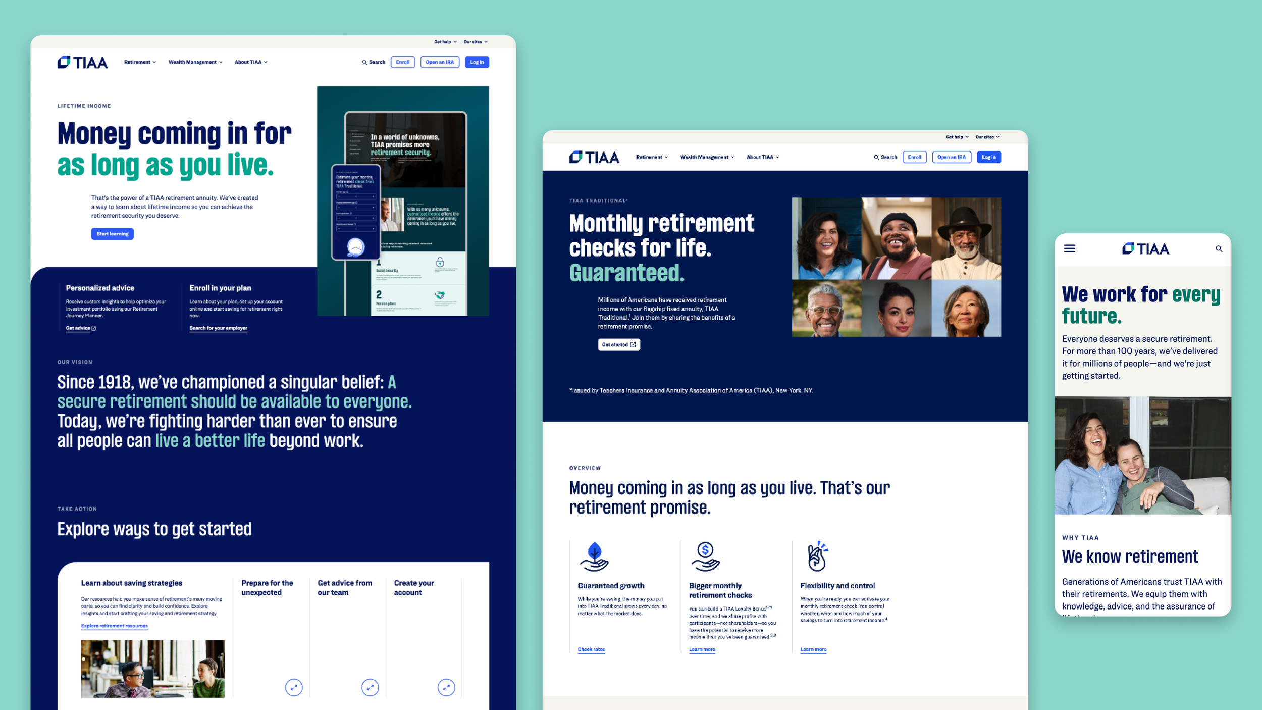
We scaled the system across screens.
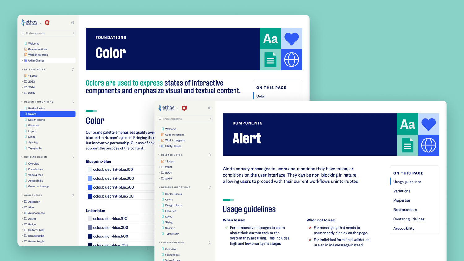
Along with the components, we shipped branded documentation with clear usage guidelines. I made sure the documentation reflected the Ethos visual language too.
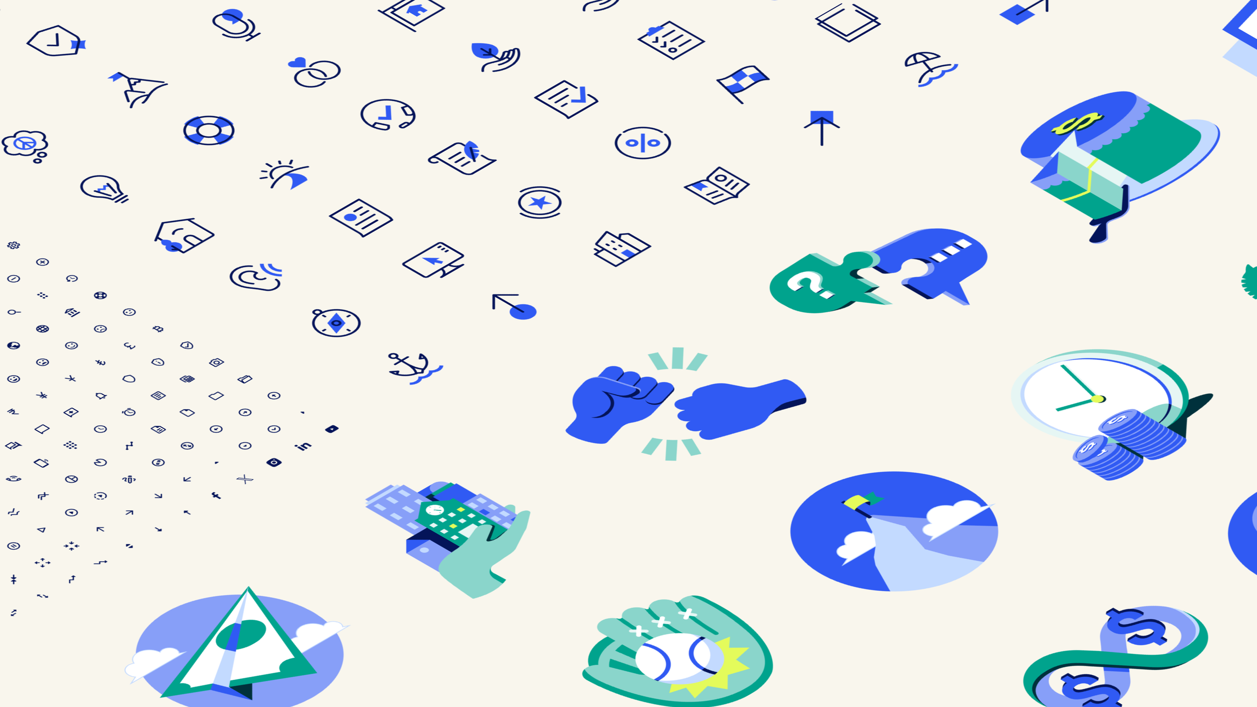
Illustrations and animations also reflected our brand colors, and enabled us to bring clarity and warmth without being too banky.
The design system atoms subtly echoed the brand.
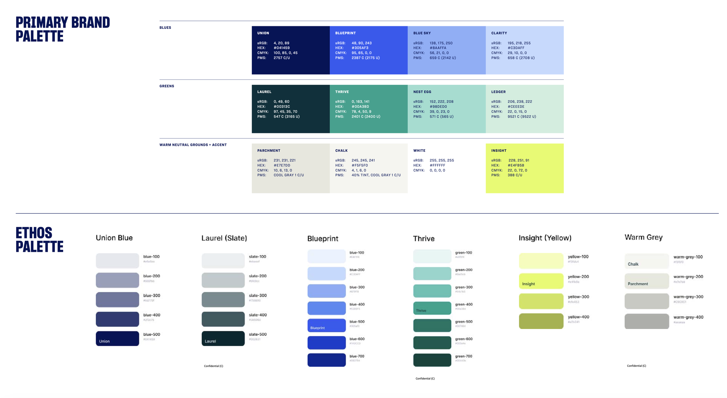
We broadened the brand palette into an accessible, UX-ready system, giving designers the range they needed while adding clear, functional colors for component states and alerts.