

Screens showing the Ethos Design System in context.
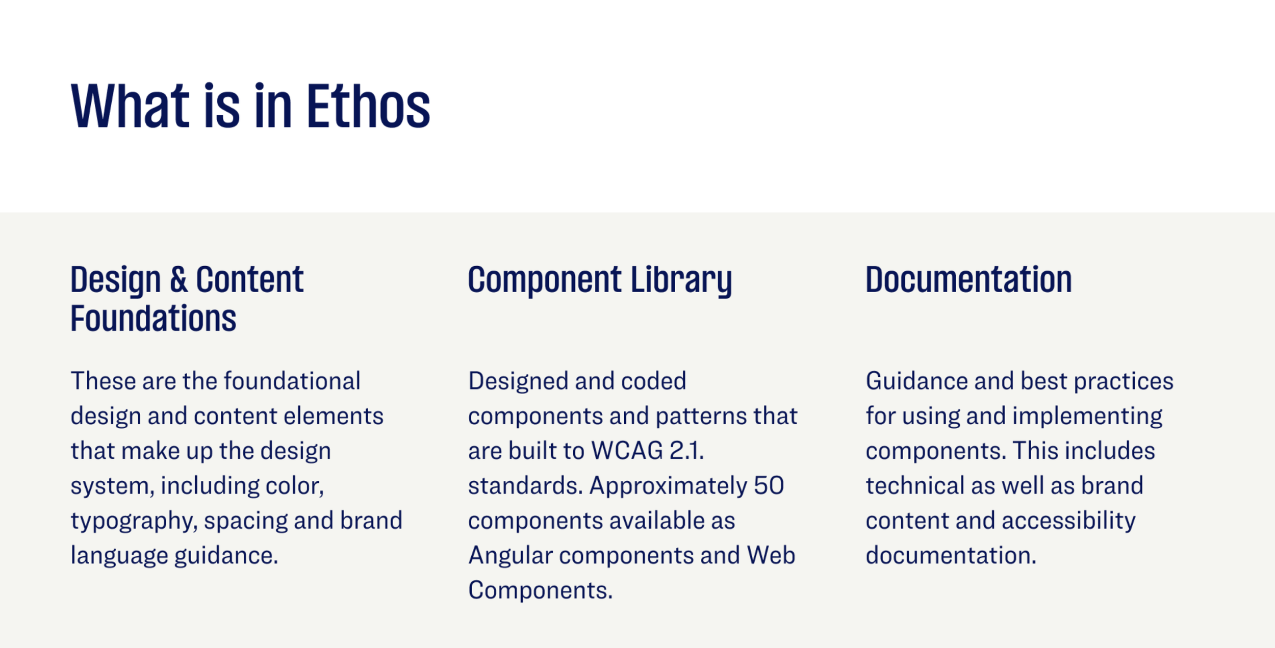
The Ethos Design System at TIAA
Building an award-winning single source of truth for a 100‑year‑old financial brand
As Managing Director and Head of UX Creative Direction, I led a cross-functional team of over thirty designers, engineers, and content strategists in creating Ethos—TIAA’s first enterprise-grade design system. In just one year, Ethos evolved from a pitch deck into the foundational toolkit powering every new experience TIAA launches. By introducing a federated model and embedding emotional design principles, I helped unify brand and UX, transforming the organization’s design culture into one that is both user-centered and brand-driven.
The Challenge
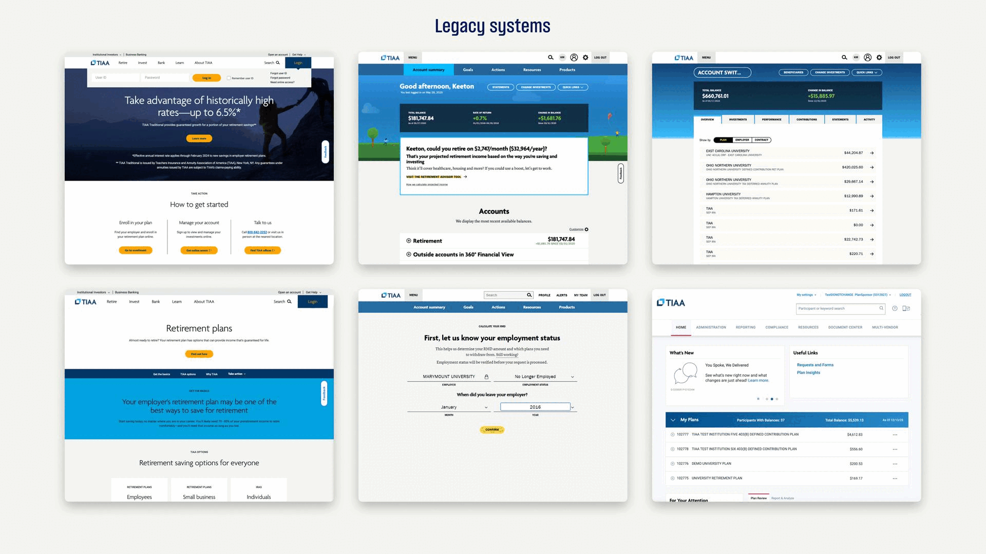
TIAA embarked on a mission to consolidate its fragmented user experience across multiple platforms. With nearly twenty distinct product design processes in play, the goal was to establish Ethos—a centralized, enterprise-grade design system to:
Streamline collaboration between design, content, marketing, and engineering teams
Reinforce brand coherence and elevate user familiarity
Improve efficiency and reduce launch timelines
Key KPIs targeted:
30% faster design-to-development handoff
Higher engagement, improved retention, and SEO lift
Consistent accessibility and visual identity across products
🛠️ Challenges
Isolated design efforts among product teams led to duplicated work and 12 different design systems
Lack of shared standards slowed down innovation and caused inconsistencies
Brand refresh plans introduced uncertainty across ongoing projects
Many features relied on custom-built components, undermining design scale
There was no central authority guiding user experience vision and execution
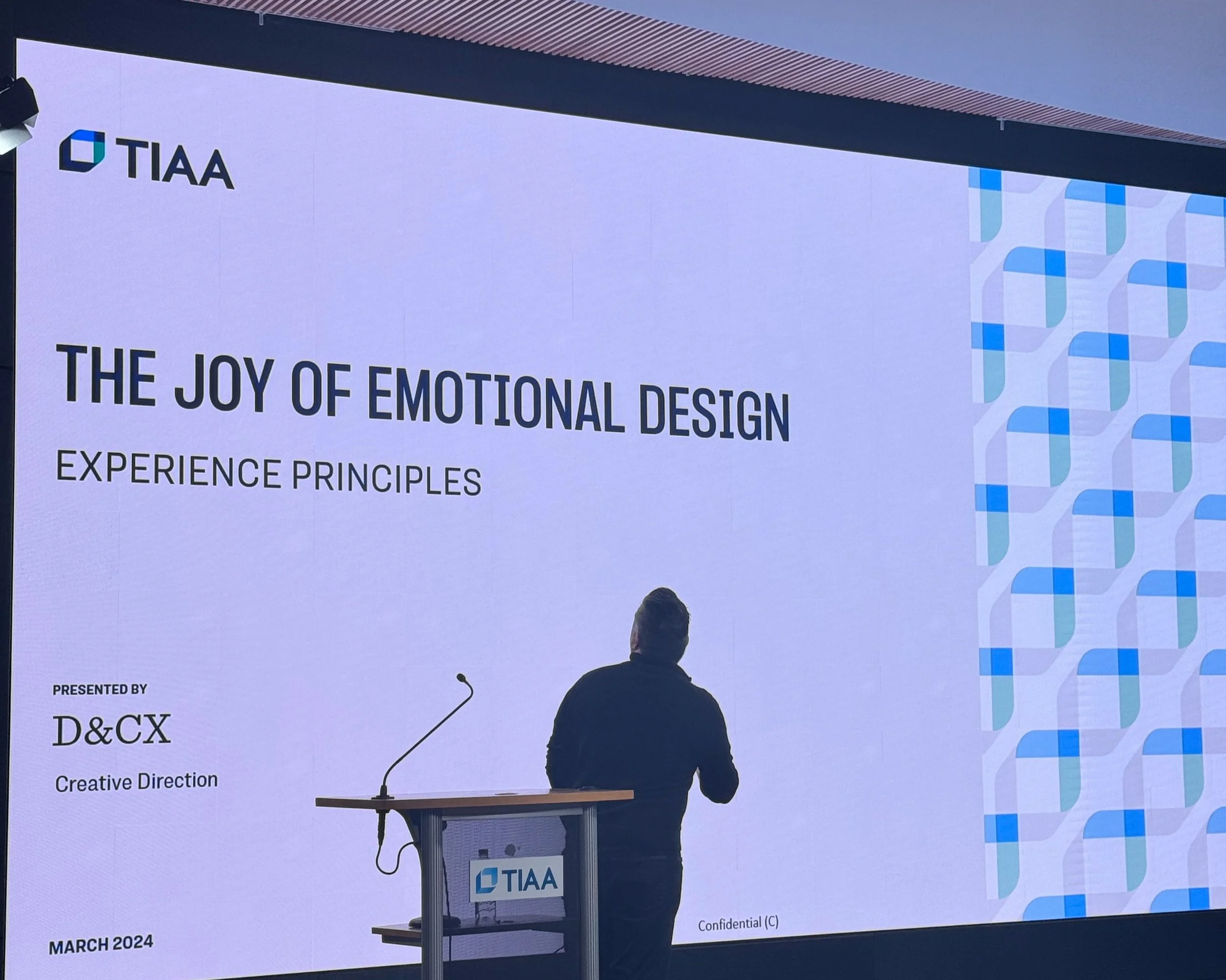
On stage our global design team summit. Look ma, design principles!
My Role
Executive owner for vision, principles, roadmap, and adoption.
Day‑to‑day creative director for all foundations, components, and content patterns.
Partner to federated Journey designers, Brand, Engineering, and Accessibility to land a new corporate identity inside product UIs.
Introduced emotional design to serve the needs of retirement’s most vulnerable customers
Process & Governance
Q1: Audit & alignment
Q2: Core component design
Q3: Rollout & documentation
Q4: Evangelism & adoption workshops
Design System Council. Monthly triage, monthly RFC approvals, and a living backlog aligned to an open Ethos roadmap
Office Hours + Teams Channel. Always‑on support and self‑serve templates kept velocity high while safeguarding quality
Accessibility First
From day one each of the 50 pre‑audited UI elements shipped with semantic HTML, ARIA roles, and WCAG 2.1 AA contrast baked in.
The kiosk‑style “Accessibility Mode” pattern became a reusable template for high‑contrast, large‑type variants across web components.

This image showcases our dynamic, tokenized theming system, which allows designers to easily toggle between four distinct, highly accessible visual themes.

🚀 Strategy & Execution
Phase 1: Foundations & Component Library
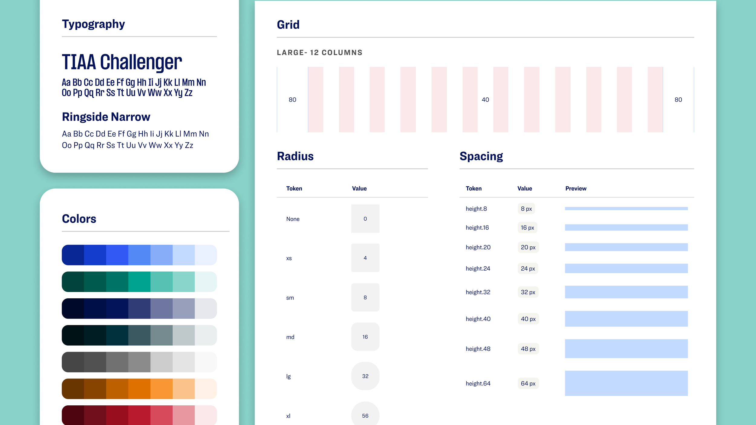
Conducted workshops to align on design principles, visual tokens, color, and typography
Built a Figma-to-code pipeline following atomic design methodology (foundations → atoms → molecules → templates)
Rolled out an “always-on support model”: internal office hours, pattern reviews, and documentation portals
Established a lightweight governance board to review new components and approve design proposals
Phase 2: Experience-Led Team
Created a cross-team Experience Direction (XD) squad to define templates, page flows, and reusable patterns
Defined Experience Outcomes to guide holistic journeys instead of isolated elements
Introduced weekly design reviews and pattern governance to enforce consistency and accessibility
Phase 3: Accessibility-First Approach
Embedded semantic HTML, ARIA roles, and WCAG AA contrast in each component from day one
Added a high-contrast accessibility mode across UI kits to support users with specific needs
Used automated checks and manual audits to block non-compliant components from production
📈 Results & Impact
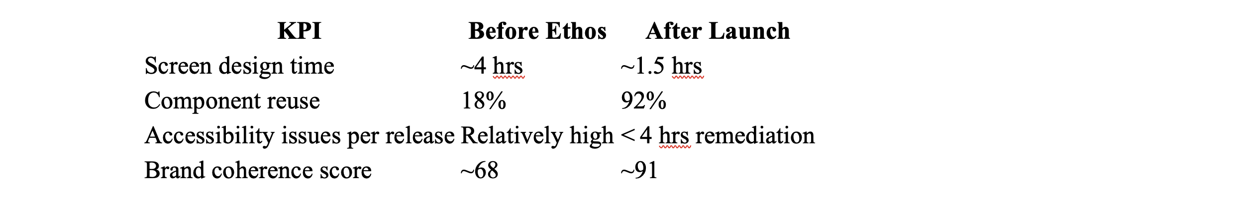
Additional wins:
30% faster build times
38% fewer UI defects after pattern audits
80% increase in enrollment starts on public pages
94% jump in advice session initiations
41% reduction in bounce rate
40% more content engagement, and a 76% SEO ranking boost
Ethos now supports 30+ product squads as their primary toolkit
Improved stakeholder confidence
Enabled consistent B2B/B2C storytelling
🔭 What’s Next
Ethos is evolving to include:
Automation workflows for partner integrations
Guidelines for motion, micro-interactions, and UX animations
Ongoing metrics tracking for adoption, velocity, and accessibility compliance
🔑 Takeaways
📦 Systems > Silos — A single source of design truth prevents duplicated effort and misalignment
🤝 Governance Matters — Structured design reviews keep quality high and standards enforced
♿ Accessibility First — Built-in accessibility delivers real value and compliance from day one
⚙️ Cross-Functional Collaboration — Designers and engineers working together build more scalable systems
📊 Measure What Matters — Tracking engagement, speed, and defect rates helps show real ROI


Ethos now powers 30+ product squads and serves as the connective tissue between TIAA’s brand refresh, content strategy, and engineering delivery pipelines.
What’s Next
Extended tokenized theming for partner white‑label needs.
Motion & micro‑interaction guidelines to drive delight across retirement planning tools.
Continued measurement of adoption, velocity, and accessibility compliance to keep proving ROI.
“One system, many teams, zero guesswork—that’s Ethos.”
